Bring it to the Table: How to Create a Memorable Tablescape with Your Wedding Theme
Back in October I teamed up with Lauren from Stone House Creative and a power-house of local (and afar) vendors to offer our first Portfolio Builder wedding editorial event for photographers and videographers. While we focused on bringing the wedding design to life through styling tables, detailed flat lays, fashion and florals, photographers played with their cameras and grew their portfolio.

The wedding design featured colours of coral, watermelon pink, taupe, honey, and a sprinkling of purple grape. It was summery, feminine, fresh and airy. Today I am sharing with you some of my favourite images captured by Jolaika Funk, how the design was reflected in the dining table details, and how you can consider your own wedding design in your tables.
One of my favourite event details to design is the dining table. It's where we ultimately gather and engage all of our senses of touch (textures), taste (food), smell (food), sound (conversation), and sight (colours). We spend the most time here, and a lot of memories are made.
When designing your tables, start with the linen. It's the biggest surface area you have to play with in terms of colour. Choose colours or neutrals that coordinate with your colour palette, of course, but consider the dining atmosphere and surroundings such as the floor and walls to really narrow down a suitable palette. For this design I wanted the linen to be a neutral canvas for colourful florals and candles. Don't feel the need to commit to one linen. A really well laid out floor plan can allow you to mix and match two or three different linens of complimenting colours, patterns or textures within the space to add a bit more dimension to the design. One easy way to add dimension is with the napkin, but for me the texture of the napkin always takes priority over colour. A napkin should serve it's purpose and be enjoyable to touch and use.


Next, select a chair. Again, consider the surroundings and the overall vibe you are hoping to achieve. The clear acrylic napoleon chair from Planned Perfectly I chose here lent to an ethereal and airy feeling, where a wooden crossback chair at this table would give a more rustic and natural look.

Include candles. As long as the venue allows, I always try to incorporate candlelight. The glow of a candle gives an inviting and romantic feeling, no matter the setting. For an elegant or stately look, alternate various heights of tall taper candles across a long table, as pictured, or opt for short taper candles for a more casual and minimal feel. Pillar candles are also great mixed in, or standalone.
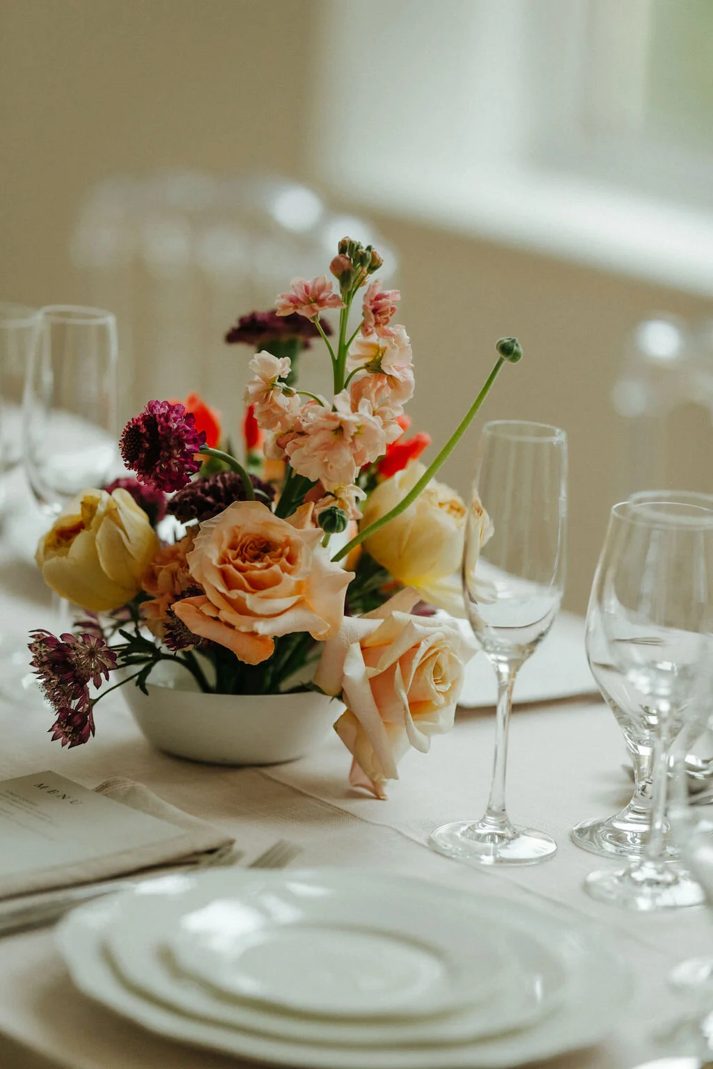
Let your flowers carry the colour palette. Flowers can do a lot of the heavy lifting in terms of design execution. Work with your florist to prioritize floral colours you are not going to be able to incorporate otherwise through the linen, candles and stationery. For this table, the entire colour palette was reflected in the florals and certainly added a lot of interest.

Lauren from Stone House Creative shares, "I completely agree with Emily's advice! You can find a lot of colours naturally occurring in the flower world that might be out of place or feel aggressive if they were used in a larger context on a table design. For example, the coral tone was really important to our design, but you wouldn't want to have a coral linen, a coral napkin, a coral menu, and coral flowers. That would be exhausting to the eye and would feel really 2004. I like to look at your colour palette as a whole, and think about percentages. You can see in these centrepieces that the coral was a tiny pop, maybe 5% of the overall colour palette, but because of its vibrance, it makes a statement.
For this table, we focused on one fuller floral centrepiece that was flanked by beautiful taper candles and a few loose blooms. Negative space is really important to a design, and something I love about the way that Emily designs a tablescape is that everything has breathing room. That breathing room (or negative space) allows each design element to have its own moment. The floral centrepiece has its moment, the candles have their moment, the detailed place settings have their moment. This floral arrangement is a bit more modern in feel, which adds a nice contrast to the natural textures throughout the rest of the table. I layered together roses, garden roses, stock, astrantia, carnations, scabiosa, and godetia to highlight the full colour palette and introduce beautiful texture."

Add a personal or custom detail. Show your personality and expand on your design story with a custom illustration on your stationery, a monogrammed napkin, a personal note to each guest, coloured glassware, or a fancy napkin fold. It can be as simple as a vellum wax seal with dried lavender buds, as added to the dinner menu at this table.
A big thank you to all the vendors involved in bringing this editorial vision to life.
Photography: Photography by Jolaika | Planning & Design: Feast & Festivities | Florals & Design: Stone House Creative | Venue: Cloakroom Wellness | Model: Havilah for Panache | Gown: Bliss Bridal Boutique | Accessories: Luna & Stone | Rings: Mokada | Makeup: Ashley Tiopo Artistry | Hair: Victoria Podkriznik | Shoes: Bella Belle Shoes | Cake: Sugar + Salt Bakeshoppe | Linen and Chairs: Planned Perfectly | Tabletop: C&T Event Rentals | Stationery: Minted